STEFANO DIVIZIA
Visual Design
Client:
Blockland S.r.l.
Project:
BLOCKLAND
Climbing Center
Role:
Graphic designer for logo,
pay off, brand manual,
corporate image, brand identity, advertising campaign, promotion, visual interior design, merchandising,
brand creative consulting,
Credits:
Partnership:
About:
Blockland Climbing Center is a brand new company based in L'Aquila - Italy.
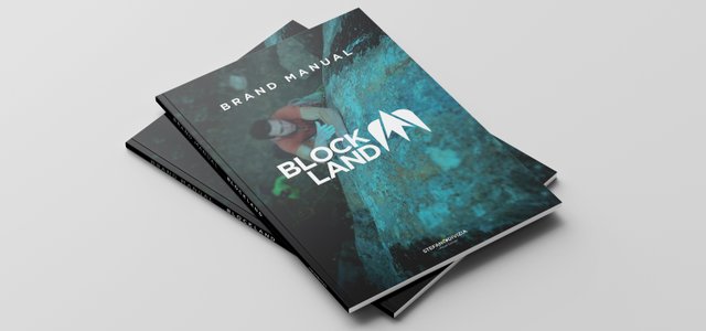
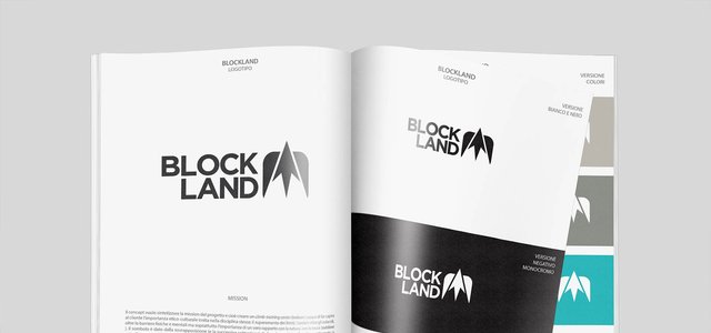
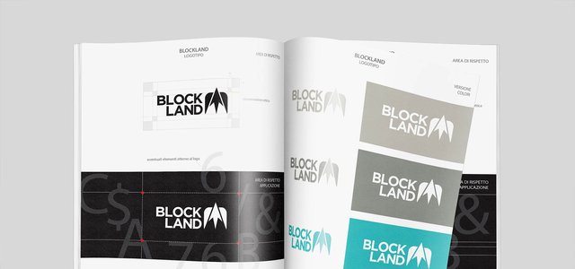
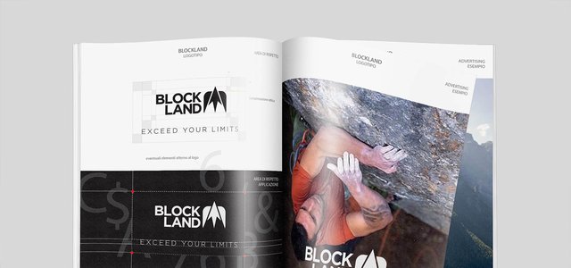
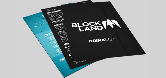
My logo proposal, presented through a brand manual, aims to summarize the mission of the project, namely to create a climb-training center (indoor) capable of making the customer understand the ethical and cultural importance inherent in the discipline itself: overcoming limits, going beyond obstacles, beyond physical and mental barriers but above all the importance of a true relationship with Nature, with rocks (outdoor). The symbol is given by the overlap (and the subsequent subtraction) of two significant elements: a rectangle (with softened edges) that represents the indoor dimension and an upward arrow that represents the overcoming of the limits and going beyond and therefore the freedom and escape. The result of these semiotic elements, obtained by subtraction, is the shape of a mountain that comes out of the rectangular box breaking through the roof of the shed. The outdoor then coincides with the arrow pointer. In a very stylized way, the symbol also represents a bird that stands out in flight, another symbol of freedom. The type of design used is flat, it perfectly supports the monochrome and the small dimensions. The removable symbol is perfectly symmetrical.
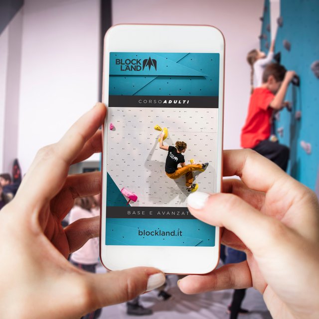
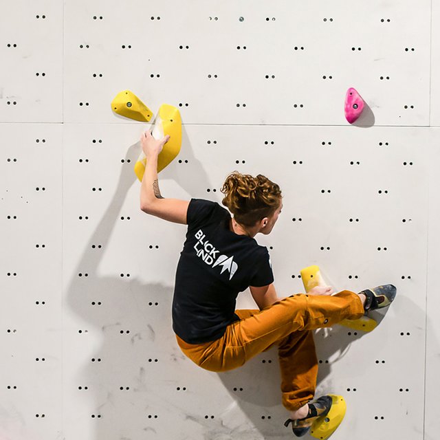
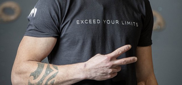
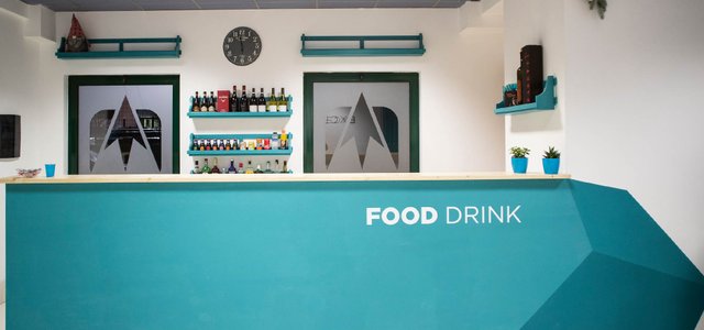
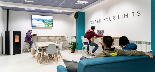
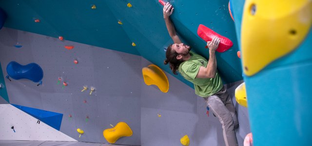
In the images there is only part of the work, which covers the creation of this new brand on several levels, ranging from graphic design for corporate image, to vertical signage, to the launch campaign, to social media managing, to advertising, merchandising and more.
Keywords:
indoor for outdoor
freedom
going beyond limits
going further
