STEFANO DIVIZIA
Visual Design
Client:
Alessandro Chiappanuvoli
Project:
CHIAPPANUVOLI
Role:
Brand image,
brand creative consulting,
logo design, corporate image.
About:
Alessandro Chiappanuvoli (L'Aquila, 1981) has a degree in Sociology of Multiculturalism and a master's degree in Management and promotion of the mountain system and inland areas (SAA, Corep, Uncem). He deals with territorial promotion, collaborates with the Design studio C28 Srl and writes articles on mountains and rural landscapes for the newspaper Virtù Quotidiane. He has published the following volumes: Tears of poor Christi. Terzigno: chronicles from the bottom of Vesuvius (Arkhé, 2011); Golgota (Zone, 2013 - Laudomia Bonanni award, young authors); Above and below the dust. All traces of the earthquake (Effequ, 2019). Among others, his writings and articles have appeared in: Stella d’Italia. On foot to mend the country (Mondadori, 2013), Alfabeta2, Effe - Periodical of other narratives (2013), The journey in the changed lands (Terre di Mezzo, 2019), Monti Sibillini - Ussita. Unpublished deviations told by the inhabitants (Ediciclo, 2020); and on the blogs: Flanerì (of which he is editor), Nazione Indiana, Il Primo Amore, Minima & moralia, Comunità Provisionalie, Artribune, Lo Stato delle Cose. For Internazionale he edited the articles on the 2016-17 Central Italy earthquake.
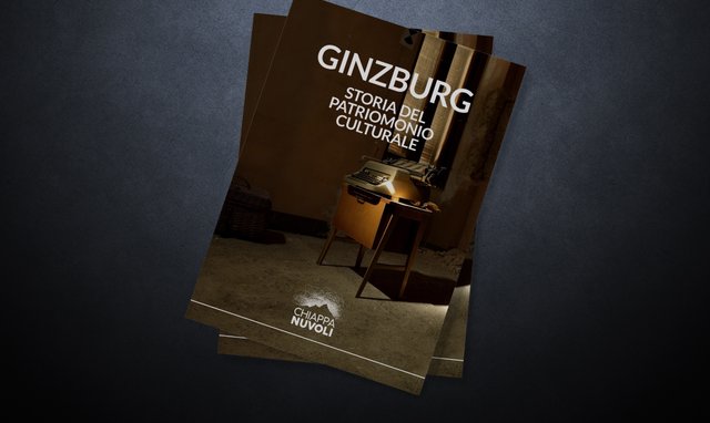
I was hired by this talented artist, as well as a friend, to build his brand identity. For the logotype I had to combine very different aspects such as impetus, the writer's restlessness of mind with something purely formal: the brand, creating a visual identity positioned on values such as stability, critical sense, balance, but also love for own territory, for nature and for writing, without however neglecting the chaotic component. The resulting graphic concept of this process is given by the union of a merely irrational pictogram, almost as if it were a scribble, which composes a cloud where, by subtraction, the skyline of a stylized mountain appears. The naming, on the other hand, is well placed, stable and balanced thanks to the use of a sans serif typeface. The whole is amalgamated in a flat design style, perfectly readable in monochrome and in small dimensions.
Keywords:
pencil
mountain
outdoor
Culture
Identity
Go local
doodles
Clouds
